

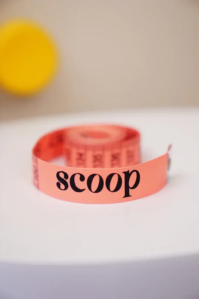
Scoop
Scoop is a size-inclusive lingerie brand for folks with fuller busts. The vision of the brand is to redefine intimate wear in India by curating collections specifically for fuller busts and plus-size bodies, thereby breaking norms and celebrating authenticity. We curate premium lingerie and offer genuine, non-judgemental fit experiences for fuller-busted individuals.
I individually led this project as a freelance graphic designer, working on aspects of market research, strategy, branding and visual communication.
Team
Client
Copy & Content
Rhea Chawla
Urooj Rizvi

Design Directtions


Primary Logo
Our primary logo is a customised version of the typeface 'Gloock', a contemporary
high-contrast serif font. The rounded contours of the form mirror the softness of the body.
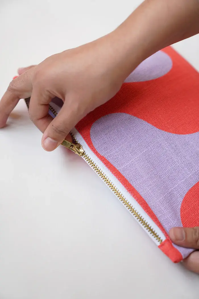
Brand Identity

Stamp
The stamp represents our wordmark and an important aspect of our brand: “Fits for fuller busts, finally”. This element was designed for communication and smaller spaces.


Brand Communication
Website

Brand Guide
